Truespirit
UX Web E-Commerce
TrueSpirit is a new internet retailer for schools and parents who want a modern school uniform for K-12 children. They do not own a brick & mortar store. As a result, they are relying heavily on providing their users a positive experience, in order to drive sales. The goal for this project was to create this positive experience for three specified user types.
*this project is a fictional project, completed as coursework for GA's UXDI immersive course
My Role:UX Design & Analysis, Information Architecture, User Interface
First Steps
Research & Discovery
At the start of this project, market research for the client had already been completed, therefore I first took the time to review this information. I studied the target consumer's market segments and purchasing habits, as well as the personas that had been developed for the user types we would be focusing on for our MVP.
Analysis & Ideation
I used the information I collected from the Research & Discovery phase to analyze, compare, and contrast our target users. I noted what was different, and what they both had in common.
I then completed a comparative analysis from the perspective of our users.
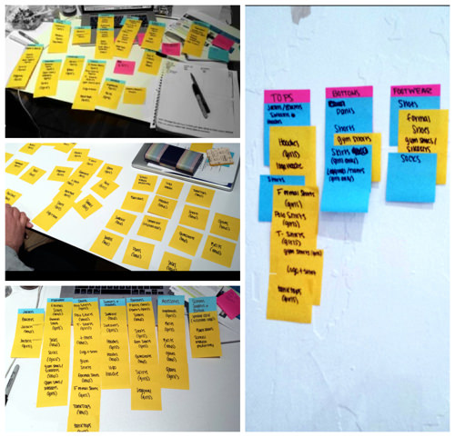
Card Sorting
Card sorting was completed in order to determine the site’s navigational structure. This helped not only to organize all of the sub-categories that fall under "clothes", but also to organize them in a way that was best for our users.
Sitemap
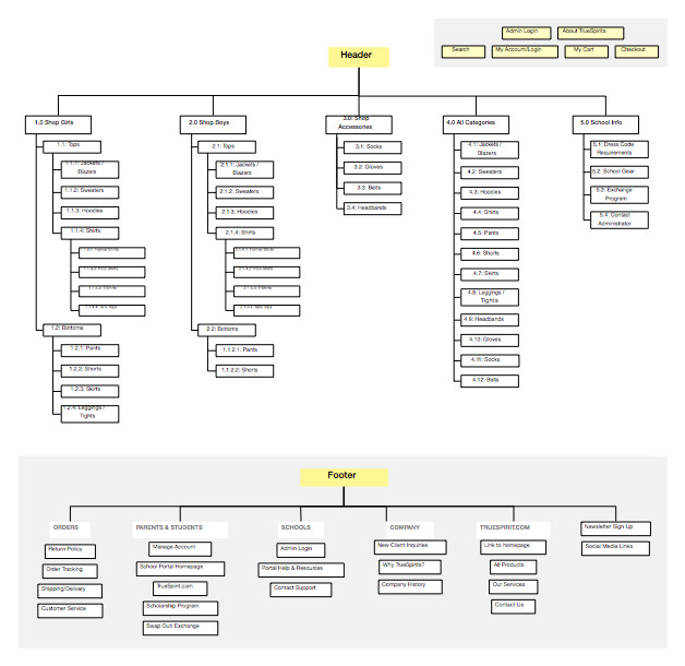
I then made a formal sitemap, to put together larger components of the site, with the categorical structure and hierarchy I had established from card sorting. This helped to also make sure that the way I was organizing information made sense.
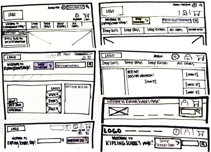
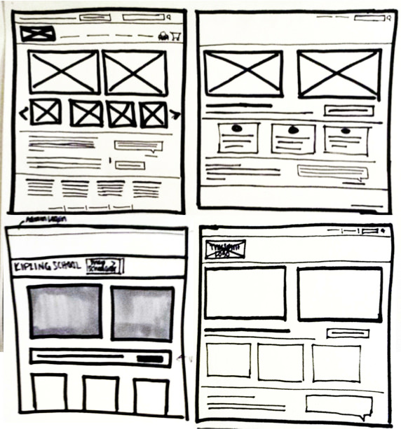
Sketching & Wireframes
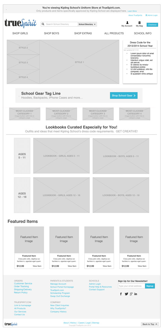
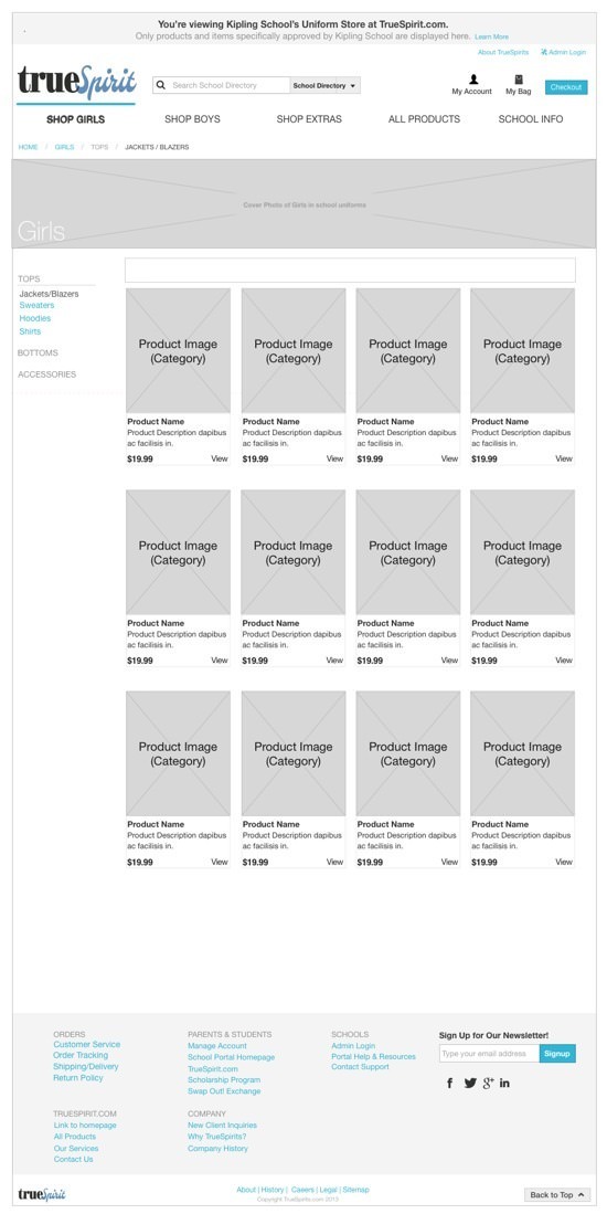
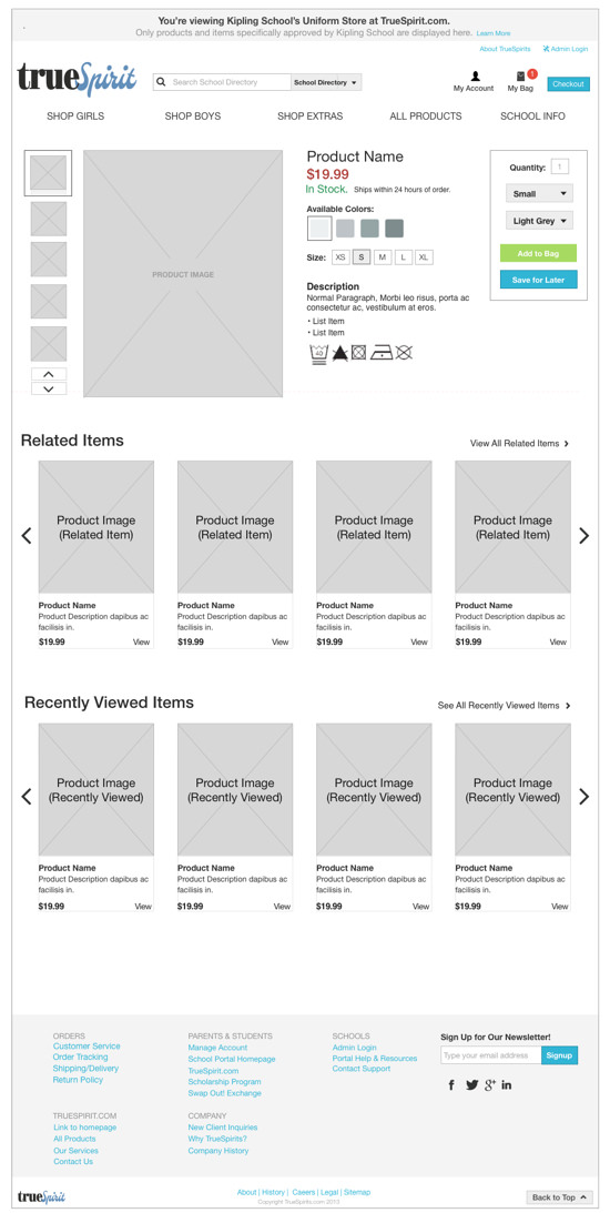
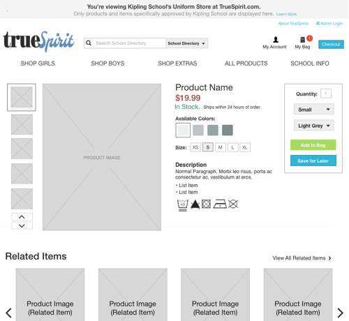
I created hi-fidelity and low-fidelity sketches and wireframes to organize my ideas and determine the structure and layout of the main pages. I used the sitemap I had created as a guide, and made tweaks to it as I drew my ideas out. One thing I focused on in particular was determining the links that users would need to access from any point, or any location within the site. I made sure that critical links like cart, account, checkout, etc, were directly accessible from the header. Secondary links, and/or links that supported these critical links, I added to the footer.
Mockups
High fidelity mockups were created using Omnigraffle to document my final proposed ideas
